Web design best practices have come a long way in the last 20 years.
When is the last time you saw an old-school HTML built website ranking highly in search engines? Or a website built using only Adobe Flash?
Probably not often if we had to guess.
Each passing year has brought new features, new standards, just about new everything to websites and their design.
Because of this, websites have had to continuously change and evolve to stay current with the trends and demands of website visitors and search engines alike.
If you want your website to be effective in today’s online world you need to ditch dated web design trends and give search engines what they want and users what they are looking for.
Where do you start? Right here:
Web Design Best Practices For 2024
- 11. Write Better Website Content
- 12. Utilize Topic Clusters or Silos
- 13. Optimize For Mobile
- 14. Optimize For Speed
- 15. Utilize Analytics Tracking
- 16. Use Landing Pages
- 17. Keep Your Website SEO Up To Date
- 18. Keep Your Website Secure
- 19. Machine Learning / AI
- 20. Progressive Web Apps
- Is It Worth It To Update Your Website?
1. Design for User Experience (UX)
User Experience is “the process of enhancing user satisfaction with a product by improving the usability, accessibility, and pleasure provided in the interaction.”
In other words, design your website with your customer in mind, period.
Your website design needs to be simple and easy to use, allowing visitors to quickly and efficiently interact with it. Any mishaps or poor design choices will send your visitors right back to where they came from and off of your website.
To effectively target the user experience your website should be:
- Useful. Is your content original and fulfilling your visitor’s needs?
- Usable. Is your website easy to use and navigate on both desktop and mobile devices?
- Desirable. Does your brand and website elements showcase you and your business in the best way possible?
- Credible. Are you presenting yourself as the industry authority that people can turn to and trust?
Keep these things in mind during the website design process as it will help you to stay focused on what’s most important – your visitors.
2. Reduce Website Choices
The greater the number of choices you offer to someone, the harder it is for them to make a decision. This is commonly referred to as “analysis paralysis” – coined by Hick’s Law as illustrated below.
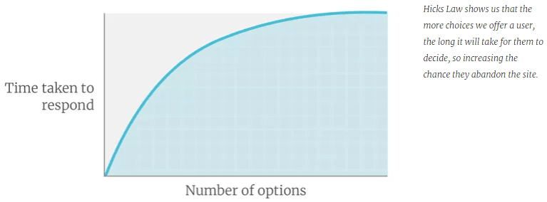
Avoid presenting too many products or services on your homepage and instead lead visitors to decisions you want them to make. In other words, turn their focus to your Call To Action (CTAs).
This could include going to specific pages, filling out a form, signing up for your newsletter, making a phone call, visiting the physical store, etc.
Keep your website choices to a minimum and chances are you will see a higher conversion rate.
3. Utilize Negative Space
Negative space between your design elements and content allows your website to breathe and be presented in an appealing way.
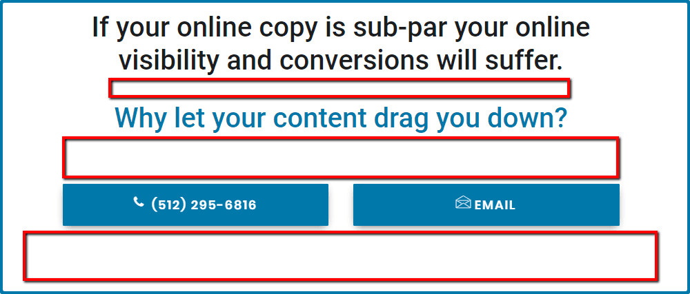
Make sure you leave ample padding between text, images, and headings.
4. Reduce Website Animations
Website animations can be used to:
- Direct users to your Call To Action (CTA)
- Make your website appear more responsive
- Make your website appear more intuitive
The over-use of animations will have the complete opposite effect – distracting or confusing your visitors. In our experience, it can make just being on your website outright annoying.
Resist the urge to overly animate your website and instead use these features strategically and sparingly.
5. Use Color Contrast
Contrasting colors will draw the eye to specific elements in your design.

Use them to highlight your logo and important words or phrases that you want your audience to immediately see.
6. Use Breadcrumbs
Depending on the size of your website, breadcrumbs can be a very useful addition to your navigation.
Breadcrumbs allow your visitors to visually see where they are in the hierarchy of your website. Like the “You Are Here” feature on maps for large places such as malls or amusement parks.
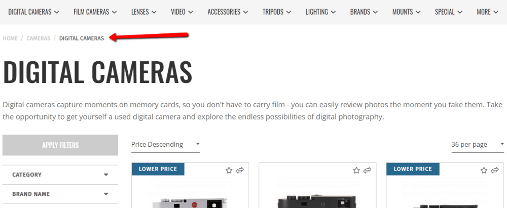
This feature is especially important on large websites, such as e-commerce websites. If you have dozens of nested products or categories you can use breadcrumbs to help your visitors find what they are looking for.
By using breadcrumbs you can help users navigate your website without seemingly getting lost in a maze of products or pages.
7. Use Human Faces
We get it, you probably don’t want your face plastered all over your website for everyone to see.
But even doing so subtly, has surprisingly powerful effects.
Consider displaying a photo of your team or owners on your about page. Putting a “face to the name” can create a sense of security in people – it helps to establish a relationship before the relationship has even started.
Not only that but displaying images of people’s emotions or expressions when interacting with or using your product has been proven to convey much more than words ever could on a psychological level.
8. Keep Things Familiar
Avoid distracting your users with different shapes or colors when it comes to your Call To Actions.
You don’t see Amazon’s website using a hundred different colored “Add To Cart” buttons, do you? Neither should yours.
Experiment and find a good balance of color and shape that attracts the visitor’s eye and stick with it.
9. Ditch Homepage Sliders & Carousels
Yes, we know. At one time these were all the rage. They’re still quite common even today.
Yet, time has proven again and again that homepage sliders and carousels cause more harm than good by:
- Slowing down website load times
- Pushing down your valuable content
- Appearing and functioning poorly on mobile devices
If you’re still using a slider or carousel consider removing it – you might be surprised by the positive effect that can occur.
10. Be Consistent with Your Branding
No matter your story, no matter your history, if your branding isn’t cohesive across all your platforms, including your website, you’re completely missing the point of branding altogether.
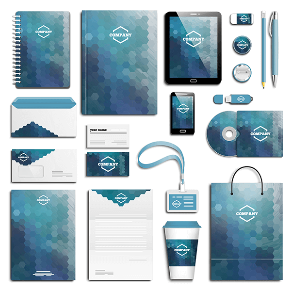
Proper branding sets your visitor’s expectations – helping you to convert new customers as well as keep old ones.
When people are researching (window-shopping) they tend to go with websites that:
- They are familiar with
- They find visually appealing
- Are similar to themselves and their own beliefs or personality
- Appear to be trustworthy enough to do business with.
Keep your branding in line with your business and your customers by ensuring that your website:
- Has the same exact logo
- Uses the same motto or slogan (Ex: Nike – Just Do It)
- Uses the same colors
- Has the appropriate personality and tone in the content
The size of your business or website does not change the importance of branding – branding is important for everyone.
Help people quickly identify and remember you across all your platforms by being consistent with your branding.
11. Write Better Website Content
The content on your website is one of the most important factors in converting visitors and appealing search engines alike.
But it can be difficult to balance the two.
So what should you do?
Write the Content On Your Service Pages For Converting Visitors
People typically visit your service pages to learn more information about your company and the service.
Create high-quality content on your service pages that will allow people to effortlessly determine:
- What the service/product is
- What some of the features of the service/product are
- What you do to provide this service/product
- What are the benefits of selecting you for this service/product
- How to contact you (CTA)
Really push to highlight the benefits of your services, not just the features. After all, you are trying to sell them on using you for your services, aren’t you?
Just focusing on the features of your service puts you on the same level as every other website or business that provides the same.
Following these tips will help you to convert a visitor into a customer.
Write the Content On Your Blogs For Educating Visitors
People come to blog posts for answers or more in-depth information about a topic.
If your website doesn’t have blogging capabilities – change it.
Blogging, when done correctly, is the key to increasing your rankings and achieving loads of free organic traffic in search engines.
You might be asking yourself – “How are blogs this useful? I’ve written several and nothing like what you’ve said has ever happened.”
That’s probably because your blogs are too shallow, self-promoting, or are targeting keywords you’re never going to rank for (at least not without some serious effort).
Instead, focus on crafting blogs that are relevant to your business, unique, in-depth, and useful, while avoiding excessive self-promotion.
Some common, well-performing blog topics include:
- Answers to common questions related to your industry or products.
- How to’s or guides for things your customers may want to do or learn themselves.
- In-depth, useful information related to a specific service or topic that you would otherwise not be able to include on your service page.
Following these tips will help you to educate your customers, increase your brand awareness, and help you rank higher and reach broader audiences in searches online.
Some Additional Content Writing Tips to Consider:
- Keywords and onsite SEO are vitally important to both service pages and blogs – ensure that you are researching and implementing these correctly or having a professional assist you.
- Use proper headings to distinguish the different sections of your content.
- Your content should sound natural when reading aloud.
- Use a font style and size that is easy to read.
- Keep your paragraphs short.
- Use bullet points to display items that would otherwise be separated by commas.
12. Utilize Topic Clusters or Silos
Topic Clusters or Silos are just advance ways of organizing the content of your website. When done correctly these techniques can have positive effects on your rankings and online visibility.
To accomplish this, and mind you I’m being very brief, you would create a central Pillar Page that broadly covers a single, specific topic.
Then, you would create as many as 15-20 blogs on the various sub-topics of the Pillar Page’s main topic. Those sub-topic blogs will only link to your Pillar Page and other blogs in the same cluster.
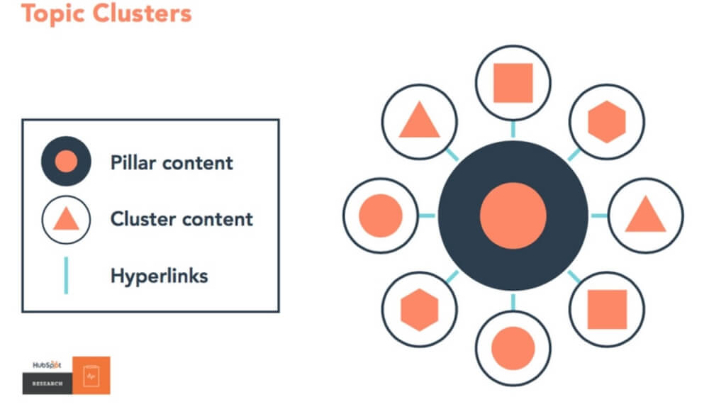
Hubspot did a great job of not only executing this strategy but also explaining it to the public:
We use this strategy on many of our client’s websites and have had great success in doing so.
13. Optimize for Mobile
You’ve probably heard that you need a mobile-friendly website a few dozen times already. Even so, it’s arguably one of the most important practices on this list.
If your website isn’t responsive to screen size and displaying correctly across phones, tablets, and desktops then you might as well not have a website at all.
Not only is this a huge disservice to the people visiting your website, but it’s also an important ranking factor. By not having a mobile-friendly website you are jeopardizing your rankings and traffic.
You can’t get by not having a mobile-friendly website anymore – it’s become the industry standard and you will lose your traffic if you don’t get with the times.
14. Optimize for Speed
If you’re not first, you’re last.
…okay, not necessarily.
But according to the Nielsen Norman Group when “47 percent of visitors expect a website to load in less than 2 seconds, and 40 percent of visitors will leave the website if the loading process takes more than 3 seconds” you need your website to be as fast as possible.
3 seconds is all it takes for you to lose a potential customer to a competitor.
How long does it take your website to load?
15. Utilize Analytics Tracking
You don’t have to have a background in digital marketing and data analysis to be able to successfully set up and monitor traffic, goals, and conversions.
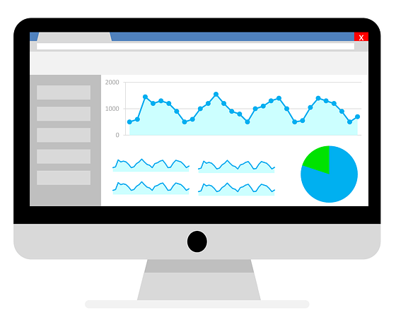
After all, if your goal is to create sales or leads via your website, wouldn’t you want to have access to this information?
There are plenty of resources online that will help you do this yourself, but if you have a web designer they should have no trouble at all connecting your website to Google Analytics and setting up goals to track on a basic level.
16. Use Landing Pages
Are you advertising on Facebook or Google Ads?
Instead of trying to direct the traffic from your target market directly to your homepage or service page consider creating landing pages specific to your user goals.
A landing page is a standalone page accessible only by your target audience when they click on your ad and should be designed with a single goal (CTA) in mind. (Sign up, phone call, contact form, etc).
Landing pages have been proven time and time again to help businesses refine their digital marketing campaigns and increase their conversion rates.
Want to learn more? Check out Hubspots guide to landing pages.
17. Keep Your Website SEO Up to Date
Search engines like Google are consistently updating their algorithms and standards when it comes to analyzing and ranking websites.
These updates can occur multiple times in a year and can result in significant changes to rankings for millions of websites, including yours.
By keeping your website’s onsite SEO to current standards you position yourself to avoid any potentially severe drops in rankings or loss of traffic.
18. Keep Your Website Secure
Whether or not you sell products online, your website needs to be secure. Not only for the safety of your visitors but also for the safety of the website itself.
Millions of websites get hacked every year due to:
- Insecure or out of date themes or plugins
- Missing security updates
- Compromised weak passwords
- Security policy holes
- Data Leaks
More information can be found here.
Do yourself and your visitors a favor by taking these proactive steps:
- Install an SSL Certificate to enable an encrypted connection to your website.
- Install a security plugin compatible with your website.
- Have your web development team ensure that your CMS platform and plugins are always updated to their latest version.*
* This DOES NOT mean you should go into your CMS platform and manually update everything – this can cause your website to BREAK. Updates to your CMS platform and plugins should always be managed and completed by an experienced web designer or developer.
19. Machine Learning & AI
Alexa, Siri, Google RankBrain – these kinds of technologies are understanding people and what they are searching for better than ever.
How do you capitalize on this fast improving technology?
This goes back to #11 – write better website content.
The better the content and user experience for your website, the higher you’ll rank and the greater your chance will be in getting the attention of these advanced technologies.
And with the emergence of new AI programs such as ChatGPT, Google Bard, Open AI, and so many more, it’s become even more imperative that your website content be of high-quality and written for people, not search engines.
You might also be interested in: “Can You Use ChatGPT To Write Your Website Content?”
20. Progressive Web Apps
To put it simply, Progressive Web Apps (PWA) are websites disguised as an app for mobile applications.
A PWA allows you to install a website directly from your browser onto your phone or compatible device – just like a native app. It will even function offline.
They’ve been talked about for years but aren’t very common…yet.
The technologies have been developed making this kind of feature a possible future industry standard in web design.
Is It Worth It to Update Your Website?
Most often the question is simply:
“Is it worth the time, effort, and money to update a website that has been doing (according to many like-minded owners) just fine after all these years?”
The answer is a resounding YES.
Nearly 50% of people cited that a website’s design is their number one factor in determining the credibility of a business – an opinion that is formed in as little as half a second!
Every year there are thousands of new websites being launched and new designs being created. Each designed to make an impact with visitors and to outdo what’s already being done by competitors.
Every year you neglect your website is another year you jeopardize your business.
Reinvest in your website to stay current with website design best practices and industry standards.
Your website will thank you – and so will your visitors.
