Restaurant owners need to have their own restaurant website design to reach potential customers online.
Sure, you could just buy your own domain, buy a WordPress theme, put in your business information, and call it a day.
But if that’s your plan you’re better off not having a website at all.
Restaurant owners need to make sure that their website is designed for their brand, specific audience, and industry.
A website designed for a lawyer will not work well when you apply that same design to a restaurant.
With this in mind, we’ve researched and compiled a list of some of what we consider to be the best restaurant websites in 2023.
Best Restaurant Website Features
Before looking at our list of restaurant websites take a look at some of the top design elements and features that make a restaurant’s web design mouth-wateringly good.
- Use high quality pictures
- Showcase your strengths and awards
- Consider using a simple one-page website design that’s easy to navigate
- Have clear Call to Action (CTA)
- Display your address, hours, and phone number prominently
- Consider using a video background
- Integrate your social media
- Make sections clearly defined
- Keep the website design consistent with your brand and brand colors
Best Restaurant Web Designs
(Click the website image to visit the website)Arts District Craft and Kitchen
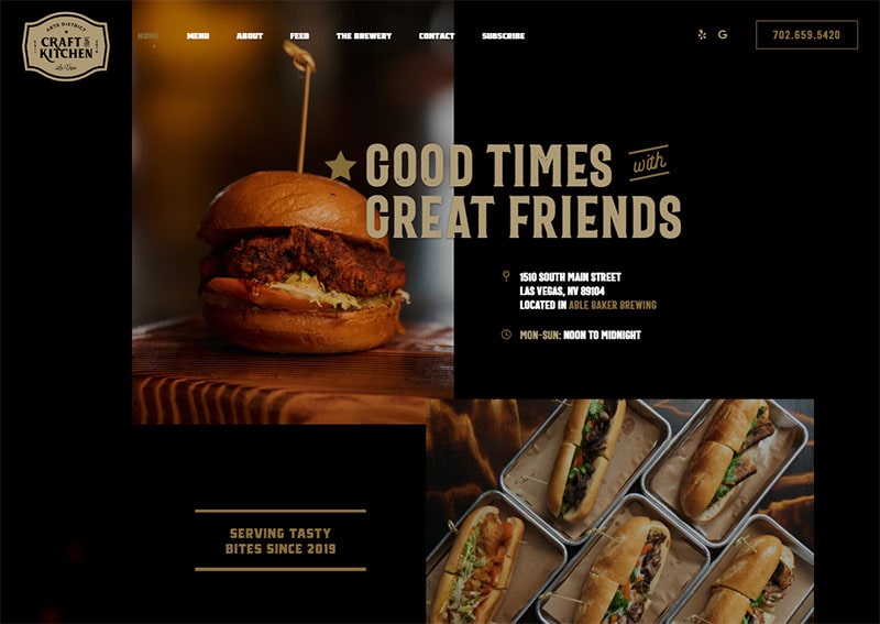
Here we have a great example of a single-page website that’s dynamic and consistent with brand colors.
By having an eye-catching photo, address, and hours at the top of their design Arts District Craft and Kitchen do a great job of getting the right information front and center.
In addition, the menu is uncluttered and includes only the most important additions – their phone number, Yelp, and Google links.
Best Website Features
- Single-page web design
- High-quality pictures
- Simple website menu
- Interactive food menu
- Downloadable food menu
Baton Creole
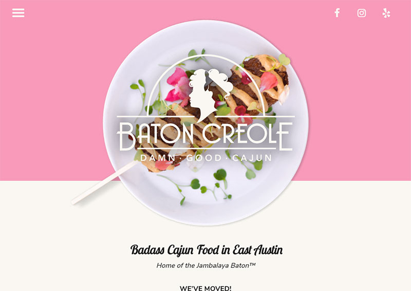
We absolutely love the bold yet minimalistic design of the Baton Creole website. The logo being perfectly set over a high-quality photo of one of their dishes is beautifully executed.
Overall, we can tell that the website was designed for maximum ease of use. The text is easily legible, buttons are large enough to be tapped on any size device, and there is plenty of space between elements.
Best Website Features
- High-quality pictures
- Larger font
- Minimal design
- Displays press
- Order online functionality
- Downloadable menu
Christopher’s World Grille
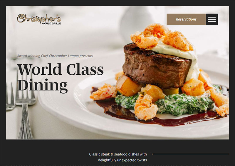
With a delicious opening image and a statement that lets you know exactly what kind of dining experience this restaurant provides, Christopher’s World Grille makes sure their web experience matches the dining experience.
The web design looks and feels much like a dining menu all while highlighting the most important bits of information such as awards, menus, rooms, and events.
Most importantly, the website menu is simplified to direct the visitor’s attention to what’s most important – making a reservation.
Best Website Features
- Fun, menu-like web design
- Highlights restaurant strengths and awards
- Provides chef bio and details
- Clear Call to Action (CTA) to make a reservation
Restore Public House
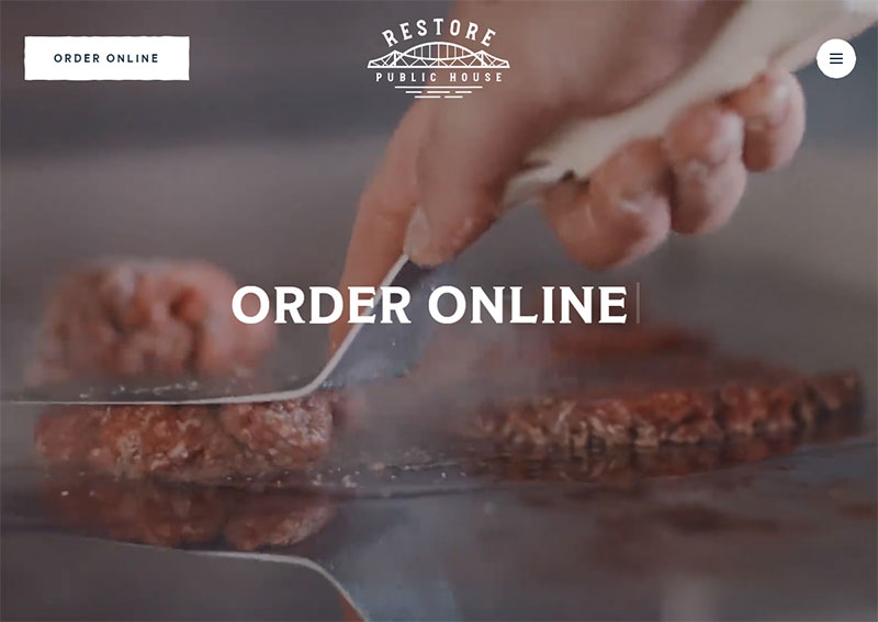
The Restore Public House website is a great example of minimalism in web design while still integrating dynamic elements that catch the eyes as you scroll.
Using video on your website can be risky, especially if the video is poorly optimized. That is not the case here. It’s fast-loading, visually stimulating, and doesn’t interfere with your ability to see their logo, menu, and call to action button – “order online”.
Best Website Features
- Minimal web design
- Good use of video
- Dynamic web design elements
- Clear Call to Action (CTA) for online ordering
4 Rivers Smokehouse
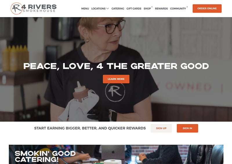
BBQ with no-fuss web design, 4 Rivers Smokehouse delivers a well laid out website with clearly defined sections, a clean menu, and great pictures.
As always important, their call to actions are clearly defined at the start of their homepage, throughout the design, and in the menu
Best Website Features
- Clear call to action elements
- Interactive menu with allergen information
- High-quality pictures
Pho Cafe
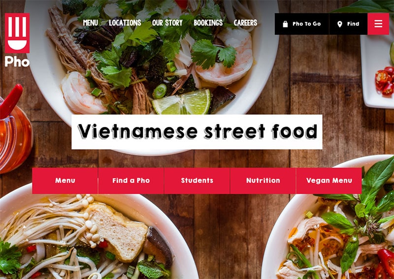
This is a restaurant website design with some serious character that sticks with the company branding.
The Pho Cafe uses full-screen images throughout the design landscape beautifully without negatively impacting the user experience, even on mobile devices.
Additionally, the subtle shading at the top of the website ensures that the menu options stay visible without getting lost in the background image.
Finally, to ensure visitors can easily access the information they’re looking for, the homepage immediately displays all of the most important options. Always a great design choice for restaurant websites!
Best Website Features
- Full-screen images that don’t negatively affect the design
- Clear call to action elements
- Design consistent with brand colors
Green Rebel
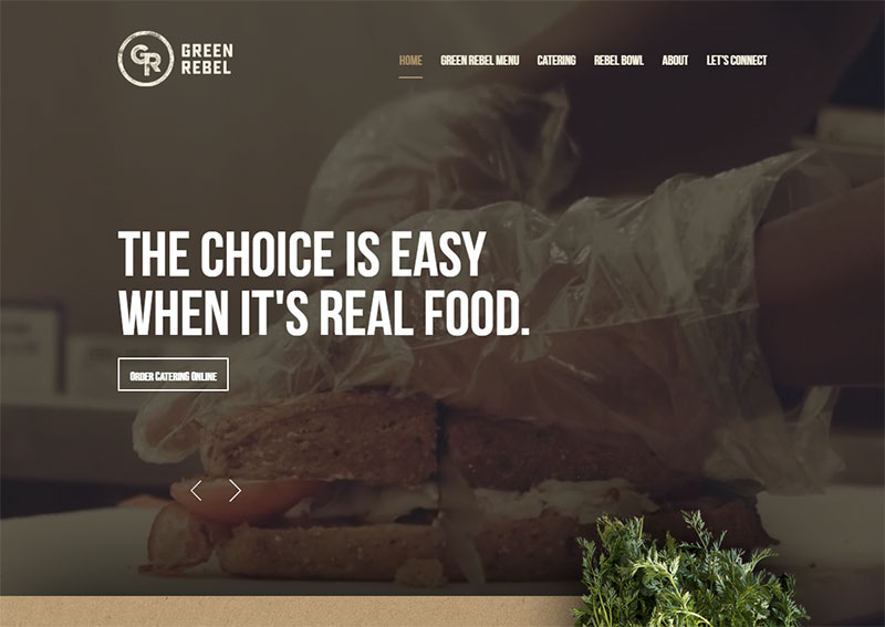
If you want your website to have dynamically moving elements, you need to look at Green Rebel’s restaurant website.
From the intro video to the dynamic vegetables that move when you scroll, this website never stops moving.
Even with all the movement, their website manages to incorporate everything into one clean and efficient package with clearly defined overlapping sections and an easy to identify sticky website menu.
Best Website Features
- Dynamic movement
- Good use of video
- Clearly defined sections
- Sticky website menu
Block 16
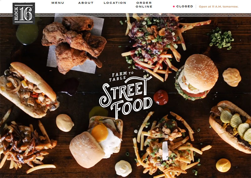
At first glance, it looks like the homepage of Block 16 loads with an image of their food. Just wait for a second longer…
This is a simple but very charismatic restaurant web design that keeps the focus on the most important things – the food menu, about their restaurant, and locations.
We also love how the menu shows if they are currently open or not as well as the hours for the day.
Best Website Features
- Good use of video
- Simple layout
- Menu shows if they are open/closed
- Textured website background
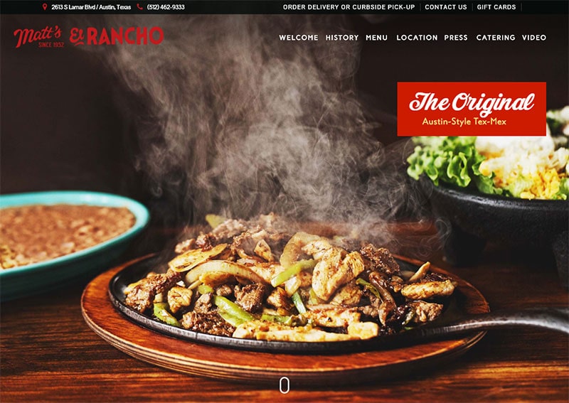
Matt’s Famous El Rancho
Matt’s Famous El Rancho is a great example of a well-rounded restaurant website that creates a unique experience for its visitors.
The slim banner across the top makes the most important details easily accessible while their sticky menu and website background uses a textured pattern to add to the uniqueness of their design.
Most importantly, their queso awards and food menus are masterfully integrated into the homepage experience.
Best Website Features
- Textured menu and website background
- Homepage slider displays high-quality food pictures
- Displays awards
- Easy access to menus
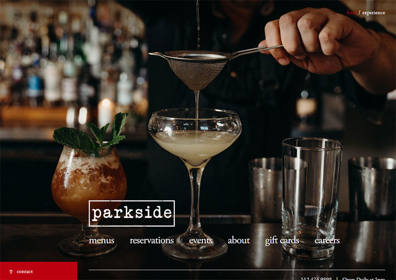
Parkside
Parkside breaks the traditional web design mold by having a single-page website and a menu located at the bottom of the page.
This is executed perfectly, leaving plenty of space on the screen to display the beautiful pictures of food plates, ingredients, and atmosphere.
Additionally, their website menu doesn’t direct users to other pages. Instead, it opens the content as an overlay on the homepage. This is a great feature as it prevents visitors from having to wait for these additional pages to load when they select them.
Best of all, their website call to action is contrasted with a bright red color making it clearly visible.
Best Website Features
- High-quality pictures
- Clear call to action
- Simple one-page website design
- Menu options open as an overlay

