Your website is often the first impression of your bakery business online – how you present yourself is just as important as how you present your baked goods!
Your website design needs to be visually appealing, user-friendly, and do a stellar job of highlighting your brand and talent.
To help educate and get you inspired we’ve analyzed a baker’s dozen of the best bakery websites online!
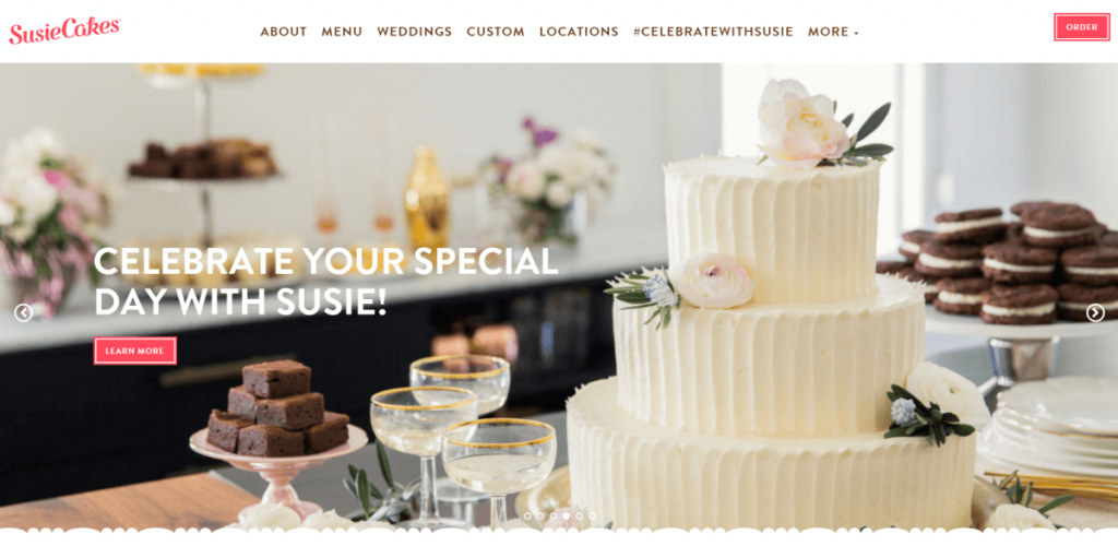
1. Susie Cakes
SusieCakes does a fantastic job of presenting its brand with a minimalistic and classy approach. The brand colors are being utilized throughout the website and menu in such a way that it makes the whole website very visually appealing.
Their website also features an integrated Instagram feed where images are populated from customers using their @celebratewithsusie hashtag. An absolutely fantastic way of showcasing not only their products but also their happy customers!
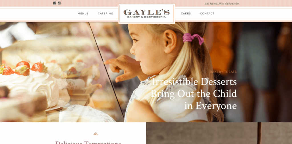
2. Gayle’s Bakery
Gayle’s Bakery is a great example of a bakery website design done right. The navigation is simple and the design stays true to the brand colors. They also use a number of features to help make their website engaging and interactive.
Their website uses:
- A homepage slider.
- A video loop.
- Interactive portals that link to additional pages.
- The ability to purchase products or gift cards online.
With a menu that puts the logo up front and center and an assortment of well-done website features Gayle’s Bakery presents themselves as unique, professional, and talented.
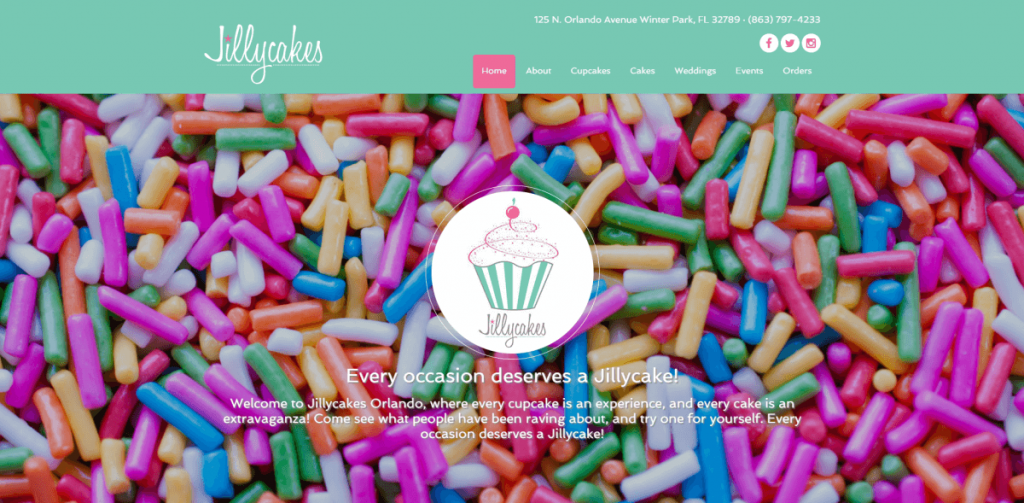
3. Jillycakes
Jillycakes does a great job of leaving a lasting first impression. When you first come to the website you are presented with the standard logo and menu – but what really makes this website pop is what happens when you scroll.
By using a sticky navigation and a static background image we are left with a very satisfying scrolling effect where the homepage content glides across the sprinkles on your way down.
As most bakery websites should, Jillycakes does a great job of showcasing their cakes through their Instagram feed on the homepage and their awards/accolades in the footer.
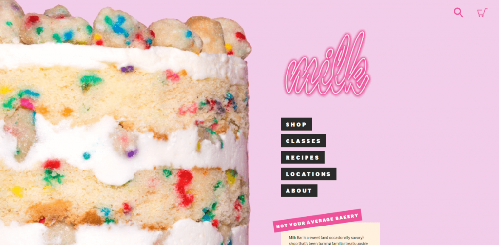
4. Milk Bar
The drooling starts the moment you visit. Milk Bar knows how to bake and they’re not afraid to show it off. By putting their baked products front and center they leave an authoritative impression that spurs immediate, irresistible cravings.
With plenty of high-quality images and useful content such as recipes and classes alongside their online store, the Milk Bar sets themselves apart from the average local bakery.
5. Porto’s Bakery
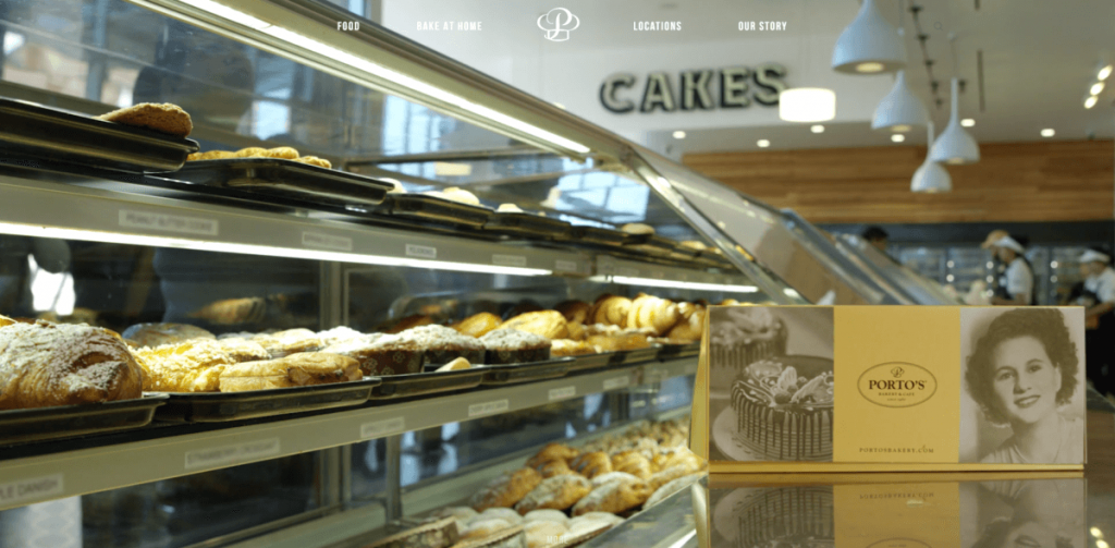
Porto’s Bakery uses both advanced and minimal design choices that provide a balanced and appealing approach to bakery web designs.
By using a full-screen video as the start of their homepage they give visitors an immediate opportunity to view scenes of their store, drinks, treats, and baking methods.
They also use a carousel feature to showcase important information including announcements, hours, catering, gift cards, and more. The menu is also both simple and intuitive, displaying a variety of food options in an appealing manner.

6. LA Baking Co.
The LA Baking Co. has a unique, single-page design. All their information is displayed on the homepage and the menu automatically scrolls users to the appropriate sections. While this isn’t great for SEO, it makes for a great user experience.
They also use a secondary menu located on the right-hand side with options to change the language on the website from English to Spanish. A unique experience indeed!
7. Bakery Nouveau
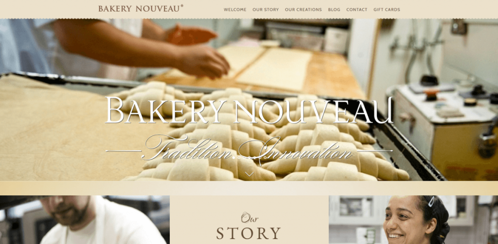
Another great example of simple and elegant bakery web design. Bakery Nouveau keeps it simple and to the point with beautiful shots of their baked products, their story, and employees. Their menu and website make good use of their signature beige colors.
They could use better calls to action to help convert visitors into customers – but never-the-less a well put together website.
8. Buzz Bakeshop
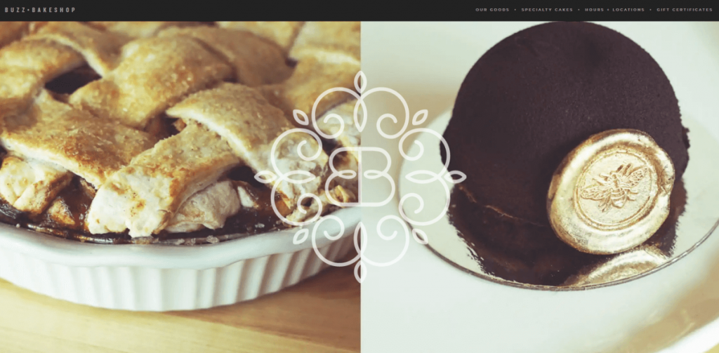
The Buzz Bakeshop makes good use of a minimalistic sticky menu and content layout. Better yet, The Washington Post wrote about them and they made sure to include that in their design.
The pattern background is a nice touch and with the 1/3 content layout, it becomes a big part of the overall aesthetic.
9. Magnolia Bakery
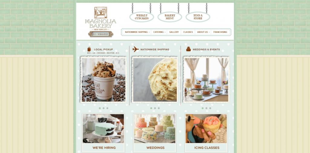
The Magnolia Bakery is unique in that it is designed in the 1/3 layout that isn’t often seen in today’s designs. It reminds us of the HTML days!
It’s well designed in its color and layout; using portals to direct users to the important areas of the website along with additional top-level menu items.
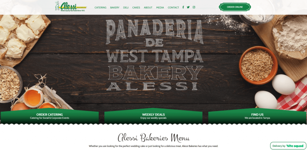
10. Alessi Bakeries
Using the logo and the main homepage image as anchors for the design, Alessi Bakeries presents a cohesive design that uses the signature green to highlight important areas of their website. This is especially useful to direct visitors to where you want them to go – be it ordering online or viewing their store location.
Leaving a section for their achievements is also another nice touch – showcasing their awards and achievements goes a long way in creating confidence in a potential customer.
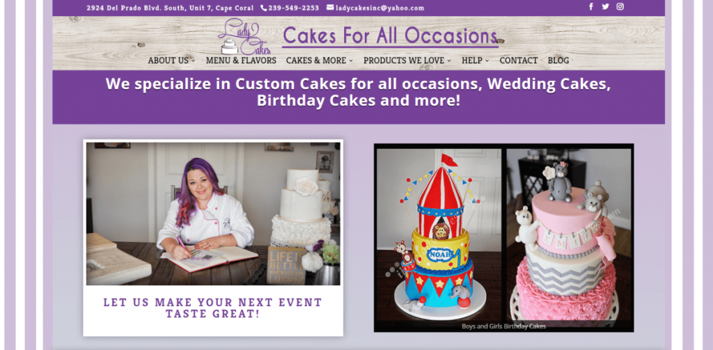
11. LadyCakes Bakery
LadyCakes Bakery doesn’t hold back with their upfront design, nor should they! The site includes an image of the owner, an informative video, pictures of each type of cake, awards, and publicity.
All of these factors create the perfect user experience, helping to build confidence and trust when someone is looking for a bakery shop or someone to do their wedding cake. And on top of an eccentric web design, this bakery website leaves a lasting impression!
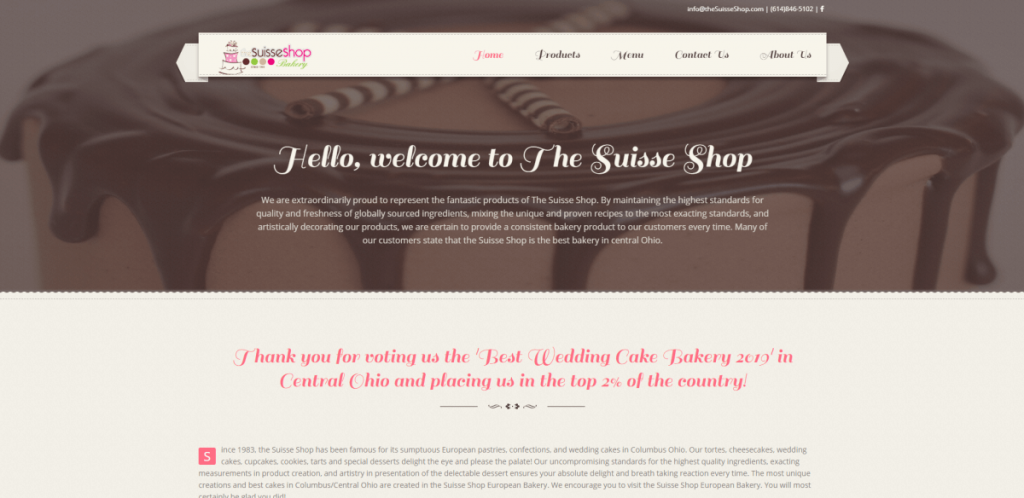
12. Suisse Shop
The Suisse Shop Bakery is a proud company having delivered over 2,000 wedding cakes and being voted as the ‘Best Wedding Cake Bakery 2019’ in Central Ohio.
Their design is simple and elegant, just like their wedding cakes. Their menu hovers centered over their image slider – a unique feature in bakery web design. They also make sure to include testimonials and a section for why you should choose their bakery – another great example of showcasing your value to a potential customer.
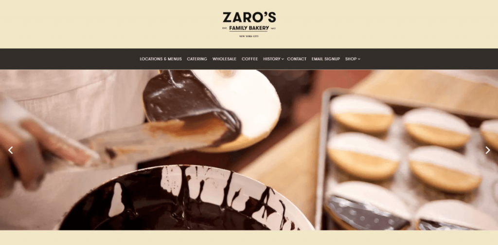
13. Zaro’s Family Bakery
Big images, boxed layouts, and appealing colors. Zaro’s Family Bakery is the last on our last and one of the most appealing.
Their design hits all the high notes:
- They use a homepage slider with images of products and bakers.
- They leverage company heritage.
- They highlight their main CTA’s – catering, locations, and online ordering.
All of this, with the integration of their Instagram feed, creates the perfect bakery website.
To Conclude…
It’s clear that when designing a bakery website, you need to consider:
- Using high-quality images
- Having Instagram integration
- Using cohesive color palettes
- Showcasing your awards and accolades
- Having the ability for visitors to order baked goods or gift cards online
Having these features on your website will ensure that you leave a lasting impression and have a website that works for you for years to come.
If you need help with the web development for your bakery business contact our web design firm. We have over a decade of experience designing websites with the latest design trends for our clients.
The key to success online is in the design of your website, contact our bakery web designers today!
