For most people, taking care of their pets is like taking care of their own child. They only want what’s best for them and that includes the choice of veterinarian.
Your veterinarian website design is often the first impression that pet owners have when they are looking for the right vet for their pets.
How you present your veterinary clinic is just as important as how you take care of the animals that come through your door!
We’ll help you get inspired and make the right impressions with these selections of the best veterinary websites online right now in 2023.
We’ve also included an example of what not to do with a website that was previously listed as one of the best but was, sadly, redesigned!
(Click the website image to visit the website)
1. Animal Care Hospital of Phoenix
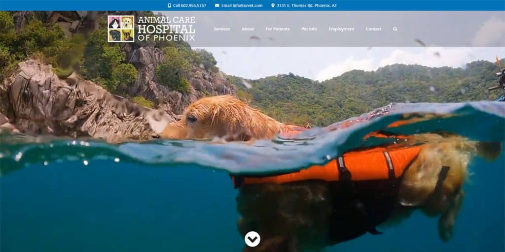
Our first veterinary website provides a stellar example of proper brand color usage and easy access to information.
Recently redesigned, it’s again easy to see how they are directing visitors to make the proper action, either by scheduling an appointment or calling them directly. In addition, they waste no time highlighting their staff and veterinary services, leaving no stone unturned.
The overall layout of this website is one well worth replicating. The sections are clearly defined and easy to navigate.
Lastly, the desktop version of the website utilizes video as their introduction, while the mobile version uses an image. This is highly recommended as it ensures an optimal user experience on devices based on their internet connection and data usage.
2. Richland Animal Clinic
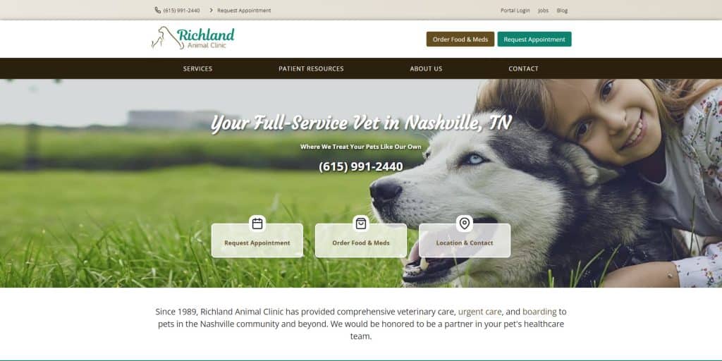
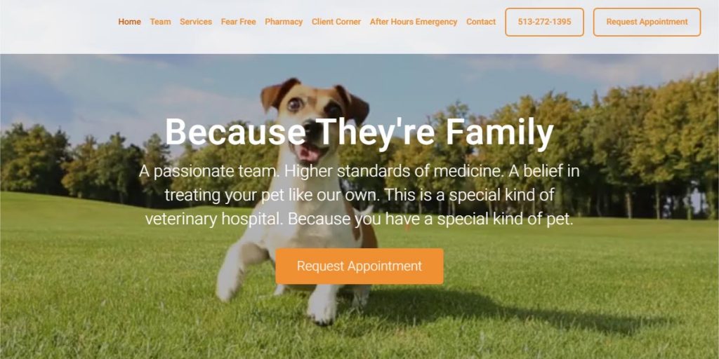
What an exceptional start of a website. Just look at how cute that pup is right alongside the clinic phone number and common user interactions including requesting appointments, order food or medication, and contact information. This is how you make an impression!
It’s immediately followed up with introducing you to the veterinarians. This is how you go from making an impression to starting a relationship.
Finally, their services, reviews, and bios pages are made available so no matter where you’re at in the decision-making process, there are clear directions for the visitors to take.
3. Orlando Vets
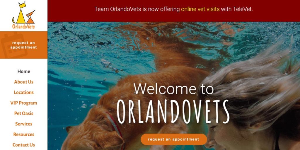
A unique interface that is well put together and easy to navigate.
What we really like about this website is the untraditional left side “sticky” menu and their use of the tabs feature. They use tabs to showcase the information for each of their multiple locations. This makes it extremely easy for visitors to find the correct contact information for the location nearest them.
Each section is uniquely designed to support the content and provide additional information and call to action for their visitors.
4. Compassionate Pet Vet
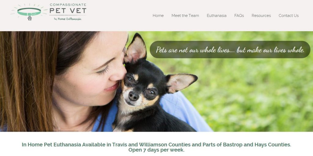
Sometimes, keeping it simple is what’s best for your audience and the team at Compassionate Pet Vet understands that.
The website is simple, subtle, and clearly made to serve the visitor’s needs. After all, if you specialize in euthanasia, people aren’t here to gawk at your website, they need your support.
This is a great example of keeping your audience’s needs first.
5. Red Bank Veterinary Hospital
Another example of an untraditional but well-designed website, the Red Bank Veterinary Hospital is designed around a very specific user action: scrolling.
In some cases, this could be very hindering for the user experience. But here, it’s done very well and that is thanks to the simplicity of the website design and content.
Simplicity doesn’t mean you can’t have robust design features, however. The homepage header is wonderfully designed with a fast loading (and cute) video and the most important feature of all, the “Request Appointment” button.
6. Heartfelt Veterinary Hospital
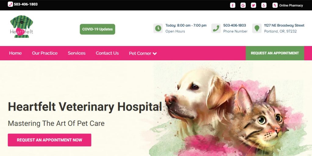
This is an example of a really well-done design that perfectly harmonizes with the brand colors.
Typically, bright colors can be difficult to work with in web design but here, it is executed beautifully. The contrast color of green is being used perfectly by only using it to highlight the header, the menu contact information icons, and the appointment button.
The design is also well put together in that it has a great “flow” to it as you continue to scroll down. They make sure to showcase important information such as featured services, the referral program, and most importantly, positive reviews.
7. The Veterinary Hospital of Davidson
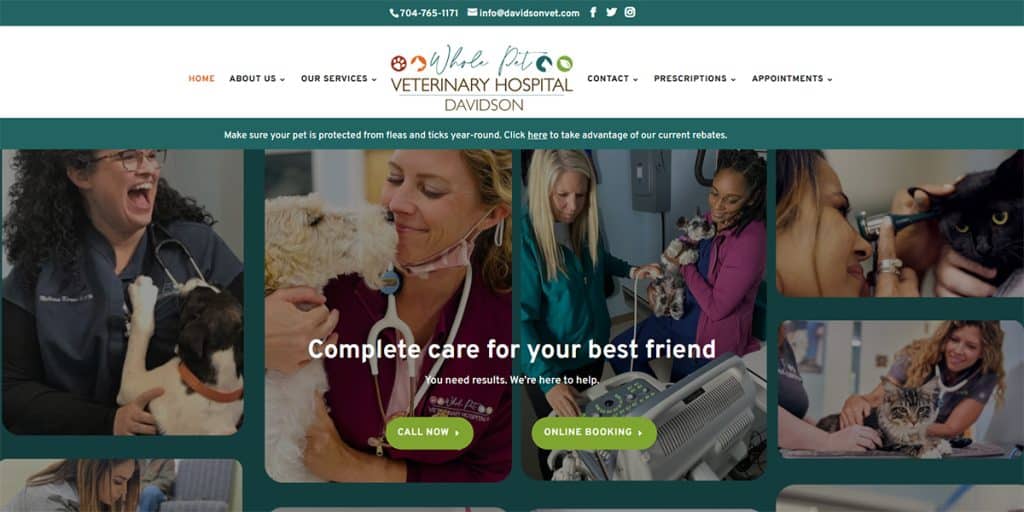
The logo, the use of brand colors, and the immediate availability of their call to action buttons make this website worth looking at.
They excel at using real images of their staff all throughout the website design, making a personable impression. We never recommend using stock images!
8. Altitude Veterinary Hospital
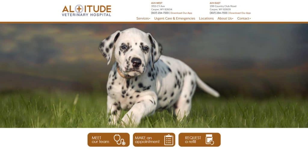
Another example of great branding and use of brand colors.
The design is very simple, but sometimes simplicity is what’s needed. As long as your call to actions are clear and the user experience is pleasant, you can do away with a flashy website design.
Their usage of links in their welcome paragraph is a bit excessive, but overall the user experience of this website is exceptional – all important business information is readily available.
What Not To Do: Greenbrier Veterinary Hospital
Once on this list for their great veterinary website design, they are now included as a cautionary tale. Redesigning your website isn’t always necessary, and sadly in this instance their redesign is a step backwards.
On the left is their previous website design, and on the right is the new design. The previous design was incredibly unique in both design and function. The new design lacks personality and isn’t compatible with larger screens which is why you can see blank white areas to the left and right.
Unless your redesign is going to go above and beyond your existing website, sometimes it’s better to stick to the saying: “If it ain’t broke, don’t fix it.”
To Conclude…
When designing your veterinary website, we recommend that you visually support your branding with proper color usage, have simple menu navigation, and make sure your design loads and appears correctly across all screen sizes.
To have the very best veterinarian website design consider having:
- High-quality images of staff and animals, avoid stock images
- Easy access to vet info including phone, address, contact forms
- A display of your positive reviews
- Service pages with information and prices
- Easy to read font with well-spaced paragraphs
- A well developed about page
- Videos of the faculty and facility
- Consistent branding in the design and color choices
Having these features on your website will be sure to leave a positive, lasting impression and provide users with a design they can really snuggle up to.
After all, if you don’t take care of your online impression, how can they expect you to properly care for their pet?
If you need help designing your veterinary website contact our web design team. With over a decade of experience in the industry, we bring the very best in web design to our clients.
The key to success online is in the design of your website, contact our veterinary web designers today!

