Nowadays, local brewing companies have become more even more common-place, especially in the more popular US cities.
Providing high-quality craft brews to beer advocates has become a competitive industry that will continue to grow in the years to come.
You Need To Take Your Brewery Web Design Seriously
If you’re considering starting your own brewery or have already started that process, you need to keep in mind that your brewery website design is just as important as your brand name, logo, and your craft beer.
To help inspire and get those creative fermentation juices flowing, we’ve compiled a list of our top picks for the best brewery web designs and the types of elements you’ll want to incorporate into your own brewery website.
(Click the website image to visit the website)
1. Ingenious Beer
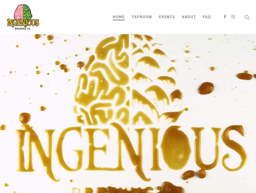
This web design makes an instant, splashing impression with an incredibly unique header video. Even more importantly, the video is replaced with an image on mobile to ensure that the website loads quickly and efficiently on mobile devices.
What makes this website even more special is the dynamic elements that move as you scroll. Seriously, go to their website and start scrolling. Ingredients, pictures, text, it’s all dynamic. We love implementing this type of feature on our own websites, it really leaves a lasting impression.
2. Oasis Texas Brewing Company
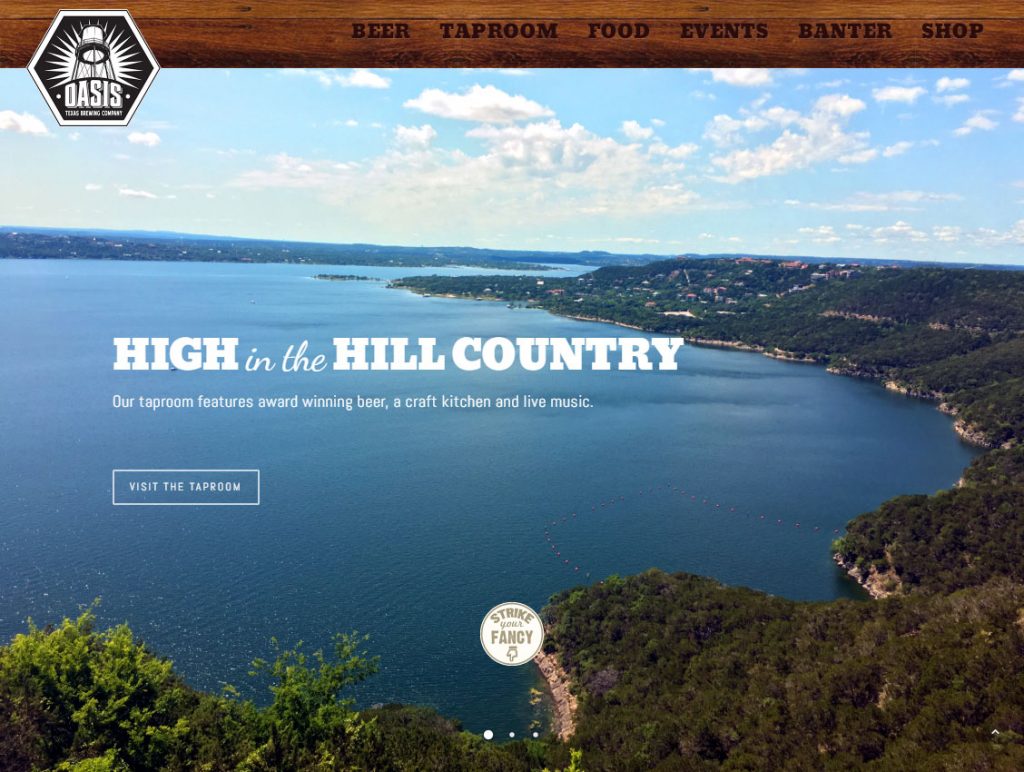
We love the opening photo of Lake Travis in Austin where this brewery is located. Additionally, their website does a great job of not only displaying their products on the homepage but providing more in-depth information upon selection.
The use of video on the home page is great too. 72% of consumers prefer video to text so it’s a good idea to incorporate video into your web design where appropriate.
3. 10 Torr
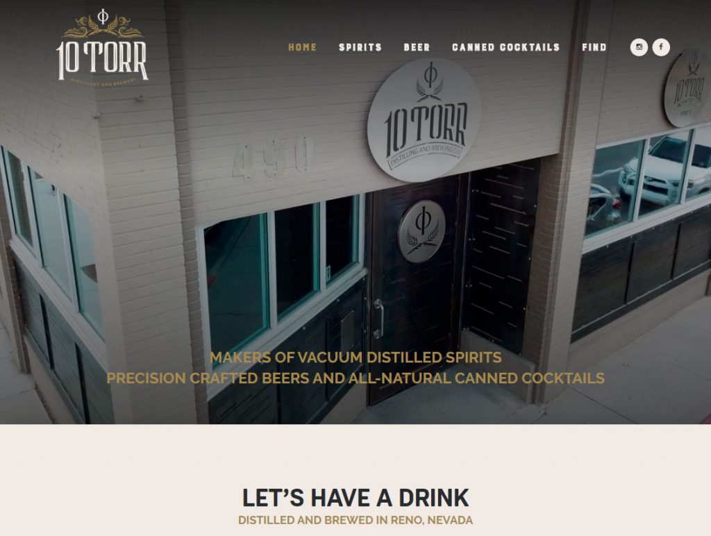
Simplicity is key here and the 10 Torr website does a great job of this. You can easily navigate and obtain valuable information including address, hours, products, and brewery information all within a well laid out homepage. They are also another great example of video use in web design.
Their use of negative space is also vitally important but often a neglected element in web design. It improves functionality, readability, and the overall pleasing aesthetic of your user experience.
4. 105 West Brewing
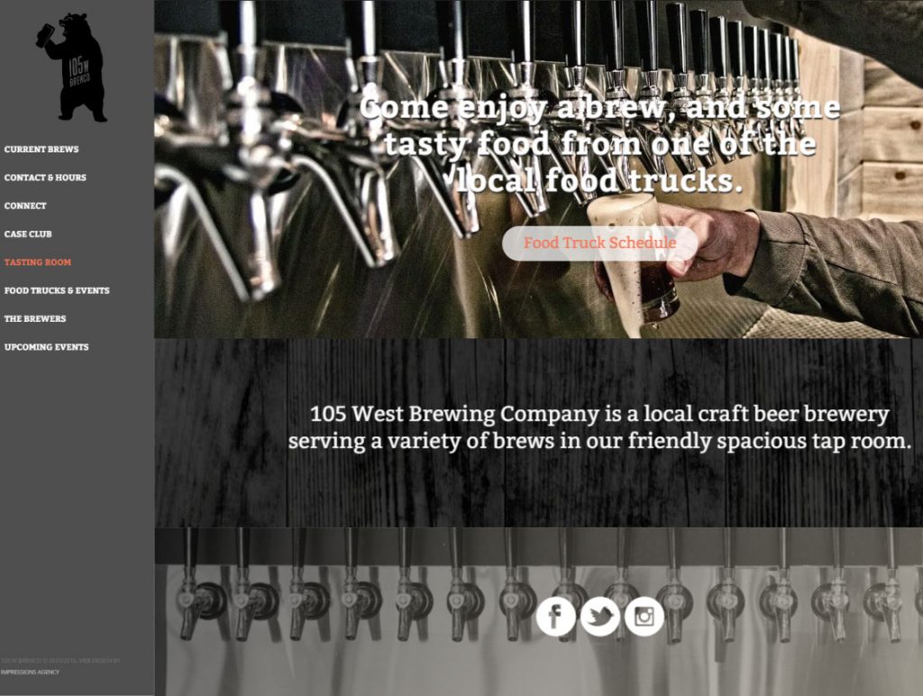
105 West Brewing brings a new perspective to brewery web design by having their website menu located on the left-hand side.
Additionally, they include their full beer menu right on the homepage. This is a great choice as many visitors are likely interested in what beers are currently available.
5. Six Car Pub Brewery
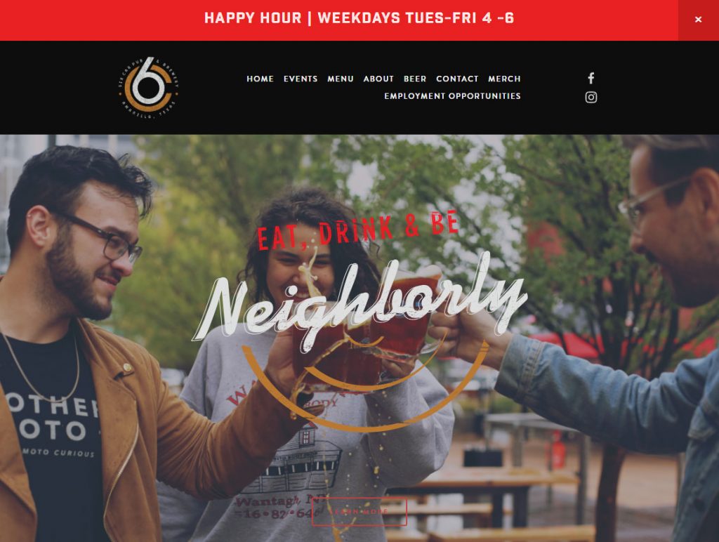
What’s the first thing you notice when you visit this website? Chances are, it was the bright red Happy Hour banner at the top of the page. This use of color contrast is #5 on our “Web Design Best Practices” article and helps to direct visitors to the important information that you want them to see.
In this case, advertising the Happy Hour special is a great way to engage and encourage visitors to visit your brewery over others that may not have or may not be advertising a Happy Hour special.
Overall, their website has a well structured and pleasing design while effectively using negative space and color.
6. Fate Brewing Company
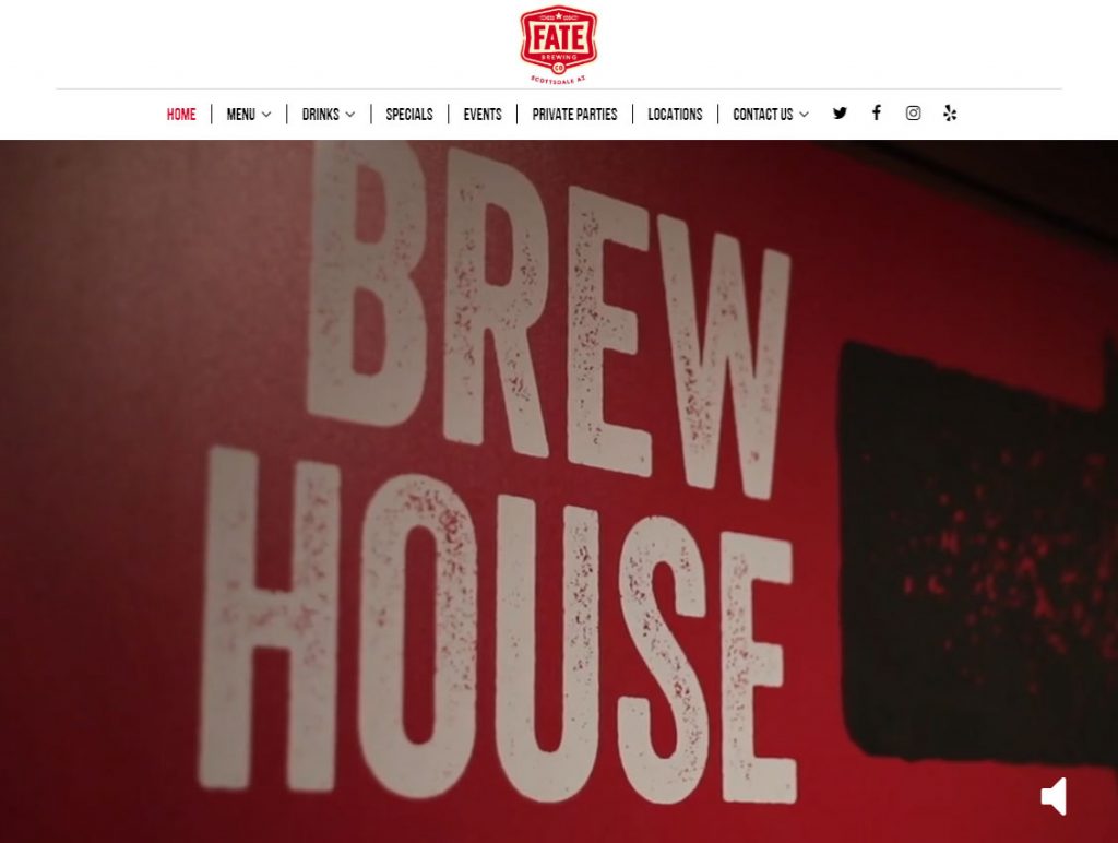
Here is another example of a well-executed brewery website with a high-quality introductory video. The video itself is optimized for optimal viewing quality that helps to avoid slowing down the website.
The content on the homepage is divided into sections. This is very important to consider doing when you have a lot of information that you want to display on one page. This will make it easy for users to scan for and find the information that they are looking for.
Overall, Fate Brewing Company provides a lot of useful information while maintaining a pleasing design and an organized structure that is well worth replicating.
7. Post Brewing Company
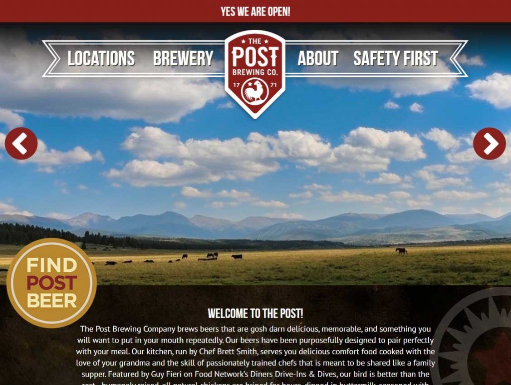
There is a lot to love about this brewery website design.
Their sticky menu is see-through but still present enough to not get lost in the design. They have a custom “Find Post Beer” button making it easy for visitors to locate their products. They also have a custom “Now On Tap” section that displays available types of beers and their ABV.
These types of features help make a very authoritative impression on their brewery. If they put this much thought and care into their design, just imagine what their beer must be like!
8. Celis Brewery
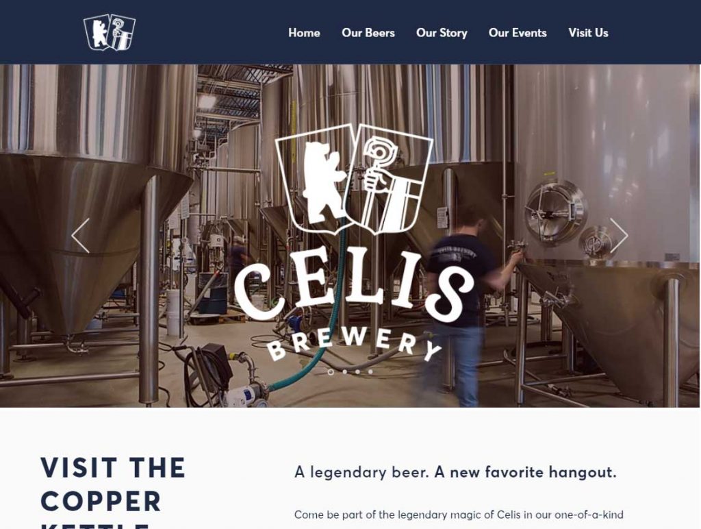
Instead of a homepage video, Celis Brewery opted for using an image slider. This is a classic feature in web design that should only be used if you intend to use unique, high-quality pictures. Here, it is executed beautifully by incorporating their logo over the images.
Their menu is exactly what most people are going to be expecting when visiting your website. For the most part, brewery website visitors are going to simply want access to your beers or menus, your story, any events, and a way to contact you.
Another great feature to consider using yourself is how they added a section specifically for the positive things that have been said about their brewery from such places as Food & Wine, Craftbeer.com, and others.
To Conclude…
When designing your brewery website remember people are visiting your website for specific reasons. Make sure you display and give easy access to:
- Your location
- Your phone number
- Your hours
- Your menu
- Your social media
Additionally, the best brewery sites:
- Use videos
- Use negative space
- Use color contrast
- Separate sections of content
- Display beers and any relevant information such as calories, ABV, etc
By keeping your website visitors’ needs in mind and incorporating these web design elements you’ll create a brewery website that will turn visitors into customers.

