A homepage has one job: give visitors enough clarity and confidence to take the next step.
Most homepages fail that job not because they lack content, but because they bury what matters most, confuse the navigation, or leave visitors with no obvious direction.
In our experience with homepage website design, these problems show up on nearly every underperforming site we audit.
We break down the specific elements that make a website homepage work and explain what goes wrong when they are missing.
Key Takeaways
- The top of the page must communicate who you are and what you do in under five seconds.
- A clear call to action should appear above the fold and again near the bottom of the page.
- Navigation menus work best when they are simple, labeled in plain language, and stay out of the way.
- White space is not empty space — it directs attention toward what matters.
- Every section of a homepage should move the visitor closer to a decision, not fill vertical space.
- High quality images and honest copy build trust faster than promotional language.
The First Five Seconds Determine Everything
A visitor who cannot tell what your business does within a few seconds will leave.
When someone lands on a homepage for the first time, they scan rather than read. They are looking for signals: does this place have what I need?
The top of the page carries almost all of that first-impression weight. Your headline needs to say what you do and who you do it for, without wordplay or abstraction.
A subheadline can add one supporting detail – a key differentiator, a location, or a specific outcome you deliver.
When we write headlines for our clients, we push for fast and accurate over clever every time. This combination does not need to be sophisticated. It needs to work on the first read.
Alongside the headline, a CTA button should be visible without scrolling. That button does not need to say “Buy now” – it should match whatever the most logical next step is for someone who just arrived. “Get a free estimate,” “See our work,” or “Talk to our team” all outperform a generic label because they name an action the visitor actually wants to take.
Navigation Menus Should Guide Users, Not Overwhelm Them
A navigation menu is the map of your website. When it has too many items, uses insider language, or hides key pages in dropdowns, it stops functioning as a guide and starts functioning as an obstacle.
In our web design work, the most effective navigation menus we build share a few characteristics:
- Five to seven items maximum in the primary menu
- Labels written in plain, descriptive language — “Services” and “Contact” over “Solutions” and “Connect”
- The most important conversion page (contact, booking, quote) either in the main menu or visually highlighted as a button
- No buried pages that a first-time visitor would reasonably want to find
Dropdowns are sometimes necessary for larger sites, but they add cognitive load. If a dropdown exists, we limit it to the pages that genuinely belong under that parent item. Stuffing a dropdown with every service or blog category turns a navigation tool into a puzzle.

The Area Above the Fold Is Prime Real Estate
“Above the fold” refers to what a visitor sees before they scroll – the visible portion of a page on initial load. Depending on the device and screen size, that window is smaller than most people assume, especially on mobile.
What we include above the fold in our homepage designs:
- A headline that identifies your business and its value
- One supporting sentence or subheadline
- A primary CTA button
- A visual – photo, illustration, or video still – that reinforces the headline
What we leave out:
- Multiple competing CTAs
- A navigation bar packed with eight items
- a rotating carousel of five messages
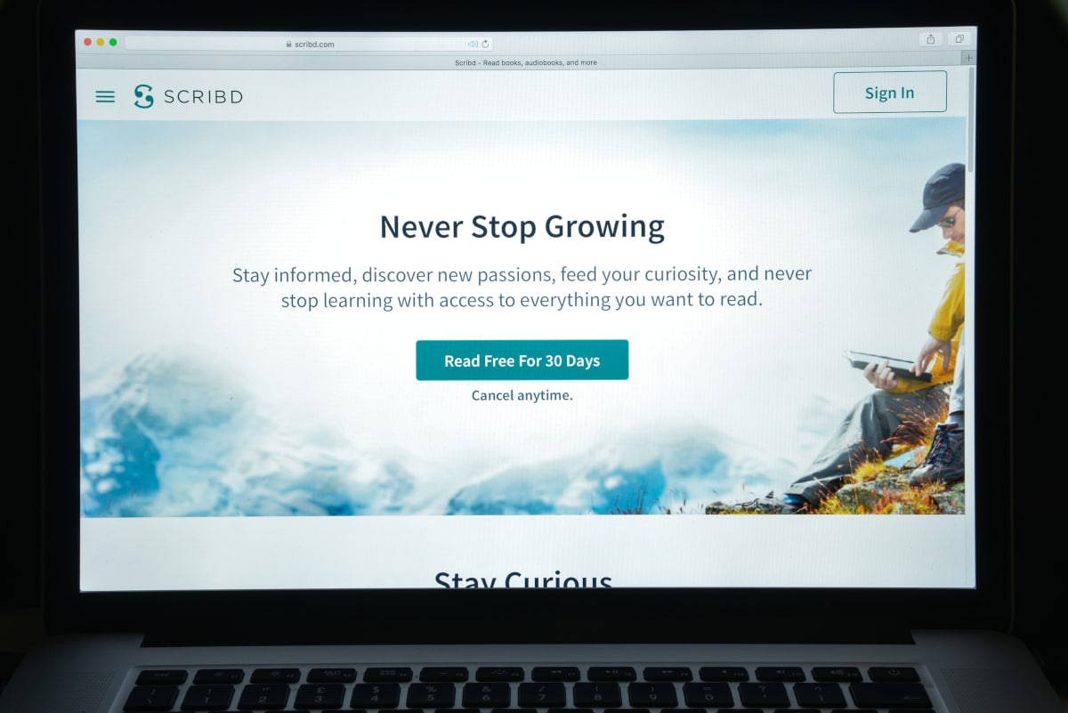
- A stock photo that has nothing to do with the actual product
Each of those elements competes for attention. Attention is finite. The more things competing for it, the less effectively any single one lands.
White Space Is a Design Decision, Not an Accident
White space – the empty area around text, images, and other elements – is one of the most misunderstood tools in homepage design.
Business owners often see it as wasted room. We use it intentionally to control where the eye goes next.
A section with generous white space signals to the reader: stop here, this matters. A section with tight, dense content signals: there is a lot here, scan quickly.
For homepage design, the first signal is almost always more useful. Visitors are not looking for everything on the first pass – they are looking for a reason to stay and a path to follow.
White space also affects readability.
Lines of text that stretch the full width of a screen with no breathing room are harder to read than text constrained to a reasonable line length with adequate spacing. Google’s web fundamentals guidance on typography confirms that line length and spacing have measurable effects on how long people stay engaged with a page.
Learn More: Web Design Best Practices
Calls to Action Need Specificity To Work
A call to action is any prompt that asks a visitor to do something.
The most common mistake we see with CTAs is that they are too vague. “Learn more” and “Get started” appear on thousands of homepages, and they are nearly meaningless without context because they describe nothing specific.
A CTA button works when:
- It names the action the visitor is taking (“Schedule a call,” “See pricing,” “Request a quote”)
- It sits next to content that has already explained why that action is worth taking
- It is visually distinct from the surrounding content
Multiple CTAs are fine on a longer homepage, but they should not all ask for the same thing.
The pattern we use for most service business homepages is: a primary CTA near the top of the page (contact or consultation), a secondary CTA midway through (portfolio or reviews), and a final CTA near the bottom of the page (another contact option or a lower-commitment action). Each CTA meets a visitor at a different stage of readiness.

Trust Signals Belong on the Homepage, Not Just the “About” Page
Most visitors who land on a homepage have never heard of the business before. They are making a rapid judgment about whether this is a legitimate, competent operation.
Trust signals are the design and content elements that answer that question without requiring the visitor to dig.
The trust signals we prioritize on every homepage we build:
- Real customer testimonials with names and specific outcomes
- Logos of recognized partners, certifications, or awards
- A clear physical address or service area — especially important for local businesses
- Portfolio work or before-and-after examples
- Specific numbers: years in business, clients served, measurable results
Generic claims do not function as trust signals because every business makes them. “Over 20 years serving Austin businesses” is more credible than “experienced team” because it can be verified. We have found that specificity consistently outperforms enthusiasm when it comes to building first-impression trust.
Images and Visuals Either Earn Attention or Waste It
A homepage image is doing work whether it was chosen carefully or not.
High-quality images that relate directly to the business, the service, or the outcome build context quickly. Stock photos of smiling people in offices that bear no relationship to the actual business do the opposite – they signal generic, and generic is forgettable.
For the service businesses we work with, real photos consistently outperform stock photography.
A photo of your actual team, workspace, or a finished project tells a visitor more about what to expect than any staged image from a library.
When we use video on a homepage, we keep it short, ensure it starts without sound, and make sure it communicates its point within the first few seconds. Auto-playing video with audio is one of the fastest ways to drive a visitor away.
The Bottom of the Page Should Not Be an Afterthought
Many homepages put significant effort into the top and then let the bottom drift into a list of footer links and a copyright notice. That is a missed opportunity.
A visitor who has scrolled all the way down has already shown more interest than most – they are a stronger candidate for conversion than someone who left after the first section.
The bottom of the page is where we consistently place:
- A final CTA with a short supporting line
- A simple contact form or phone number
- A summary of what makes the business different
- Social proof – a strong testimonial or a review count
None of these requires much space. A two-column layout with a brief message on one side and a contact form on the other is usually enough. The goal is to give a committed visitor an easy next step rather than ending the page with nothing actionable.

Mobile Layout Changes What Homepage Design Means
More than half of web traffic arrives on mobile devices. A homepage designed only for a desktop screen does not translate automatically – it breaks. Text that was readable at desktop width becomes microscopic on a phone. Buttons that were easy to click become impossible to tap.
Mobile-first is the standard we build to, and that means:
- Touch-friendly buttons with adequate spacing (Apple and Google both recommend at least 44×44 pixels for tap targets)
- Headlines that still communicate the message at a smaller size
- A simplified navigation that opens cleanly from a menu icon
- Images that crop or stack without losing their point
Page speed matters more on mobile because mobile connections are slower. A homepage that loads in two seconds on a cable connection may take six on a mobile network. Large uncompressed images and unnecessary scripts are the most common causes – Google PageSpeed Insights identifies both and tells you what to prioritize.
What Good Homepage Design Looks Like in Practice
The components covered here – fast communication at the top, clear navigation, strategic CTAs, white space, trust signals, relevant visuals, a useful footer – do not work independently. They work as a system.
When we build a homepage where each section earns its place and every element points the visitor toward the same next action, the result is a page that functions: one that a first-time visitor can read, understand, and act on without friction.
If your current homepage is not performing the way you need it to, our free website audit will tell you specifically where it is falling short and what to address first.
Conclusion
A homepage that works answers the visitor’s questions in order: who is this, what do they offer, why should I trust them, and what should I do next.
Every design decision – from the headline to the CTA placement to how much white space surrounds each section – either helps answer those questions or gets in the way.
Getting the structure right matters more than getting the visual style perfect, because structure drives behavior, and behavior is what turns visitors into customers.
Frequently Asked Questions
What should be on a homepage?
A homepage should include a clear headline, a brief description of what the business does, at least one call to action, trust signals such as testimonials or credentials, and intuitive navigation. Longer homepages for service businesses often also include a portfolio or case study section, a brief “about” summary, and a contact option near the bottom of the page.
How many CTAs should a homepage have?
Most homepages benefit from two to three CTAs placed at different points down the page, each matched to a different level of visitor readiness. A primary CTA near the top, a secondary one in the middle, and a final one at the bottom covers most visitor journeys without overwhelming anyone.
How long should a homepage be?
There is no fixed answer, but a homepage should be long enough to answer the visitor’s most likely questions and short enough to avoid padding. For a service business, this often means five to eight sections. The right length is whatever it takes to move a visitor from curious to confident.
What is the most common homepage design mistake?
Burying the most important information. Too many homepages open with a vague tagline, a large decorative image, and no clear CTA. Visitors who cannot tell what you do or what to do next will leave. The fix is putting the essential message and a specific CTA where they can be seen immediately — before the first scroll.
Does homepage design affect SEO?
Yes, directly. Page load speed, mobile usability, heading structure, and internal linking all influence how search engines crawl and rank a homepage. Beyond technical factors, a homepage that keeps visitors engaged longer and encourages them to click through to other pages sends positive signals to Google. Good homepage design and good SEO support each other – they are not competing goals.