Having a well-designed winery website is just as important as the wine your company makes.
A website designed with the latest design trends, easy access to wine shopping, and unique design elements will help you stand out from your competitors and turn a website visitor into a real life customer.
The most important aspects of any well-designed winery website is to:
- have a mobile friendly design that is responsive so that no matter the device, be it a desktop, tablet, or phone, your website will look and function properly.
- have proper onsite SEO implemented so you have the best chance of ranking for winery searches in your area.
To help you brainstorm design ideas we’ve compiled a list of the 12 best winery websites. We also included one not-so-good website just so you can be doubly sure you avoid making the same mistakes!
(Click the website image to visit the website)
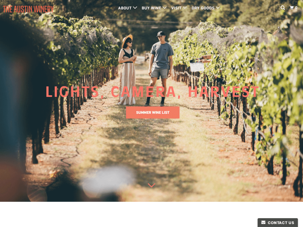
2. The Austin Winery
The website opens up beautifully with a full-screen picture of no other than Zoe Deschanel doing film work on the vineyard grounds. How cool is that?
Celebrities aside, the design is very well laid out with elements being introduced with animations and backgrounds incorporated with parallax to help make the website alive and moving.
Unfortunately, the menu has some issues with the drop-down options disappearing (might just be us?) but overall the is a great example of good structure and wine website design.
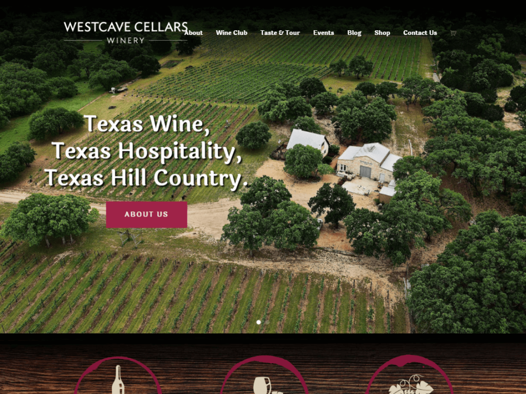
3. Westcave Cellars Winery
By now you may have noticed that a steller opening picture is a popular trend with WordPress web design and Westcave Cellars does this beautifully with an overhead shot of their building and vineyard grounds.
The design does a great job of showcasing their wine club, top-selling wines, and a bit of the history behind the grounds. With easy navigation and up-front pricing, their design makes it easy for wine lovers to buy wine online or visit the winery in the Texas Hill Country.
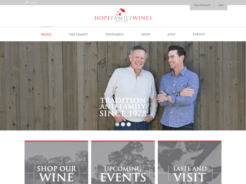
4. Hope Family Wines
You know what makes this a great website? The use of minimalism. Nothing is too overdone here. The subtle color scheme of cool grays matched with vivid reds makes the design very pleasing to the eye and it’s used consistently throughout the website.
Another nice touch is their use of a Call To Action – requesting that visitors follow them on popular platforms such as Instagram or Yelp as well as a newsletter signup form so visitors never stay too far away from their online marketing efforts.
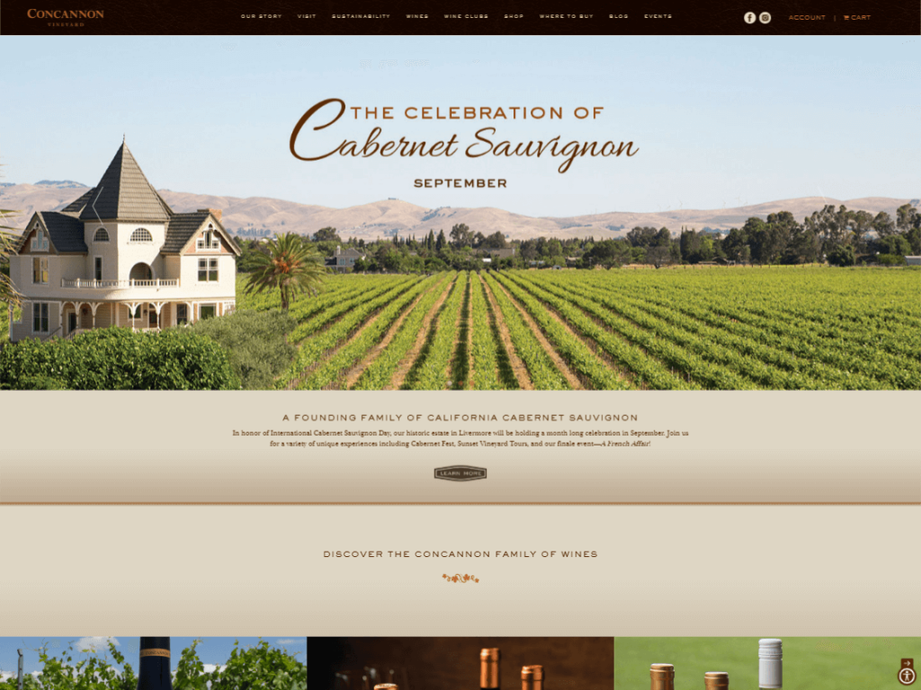
5. Concannon Vineyard
Having and using professionally shot photos on your website should be a standard, but you’d be surprised how many people would rather just use photos from their phone.
Not Concannon Vineyard. Their website has a beautifully solid design and what really makes this a great website is the use of well-photographed pictures. To take it up another notch, the images are set with an overlay so that when your mouse hovers over the image more information will appear.
To ensure that their website generates income, they’ve included a well designed shop page that makes it easy for shipping wine across state lines as well as a “Where To Buy” menu option in case you can pick up their products locally.
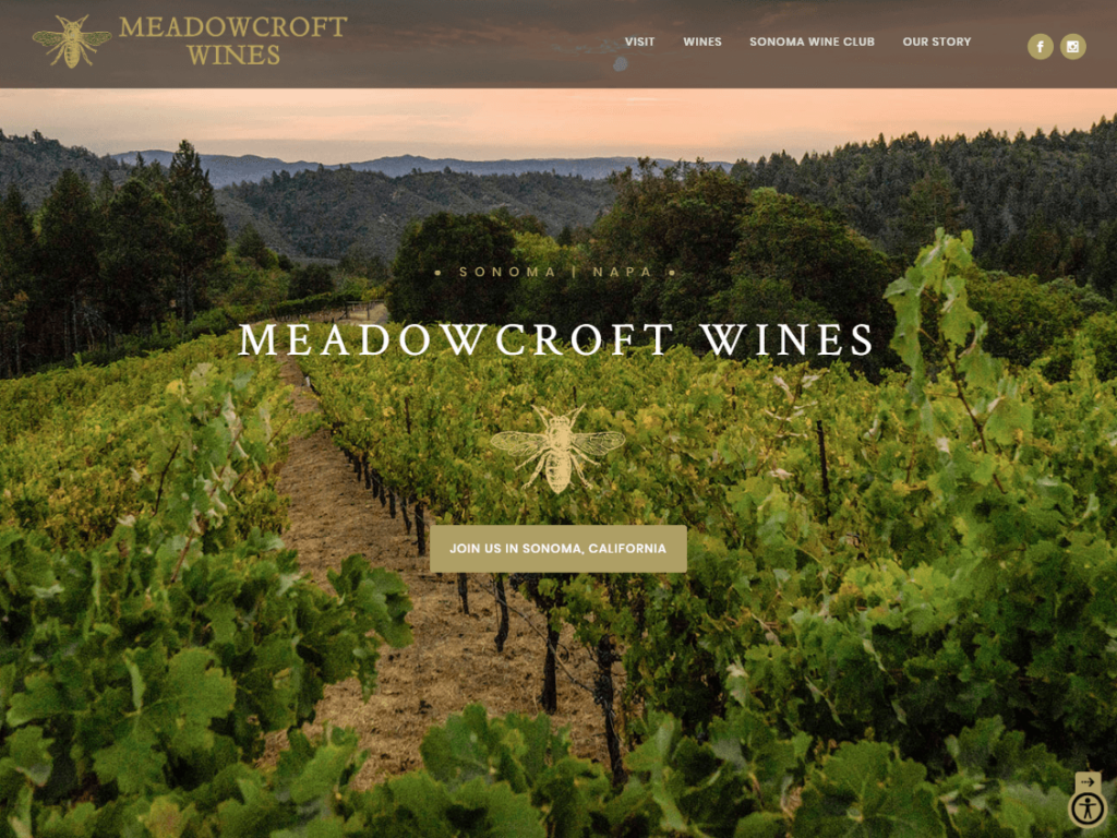
6. Meadowcroft Wines
As with any company, it’s important to have branding that is unique and easily recognizable. Incorporating your branding into your website should be a no-brainer!
With Meadowcroft Wines, they did it right by including their branding in the design of their wines and their website. Check out their custom designed footer too, a nice touch!
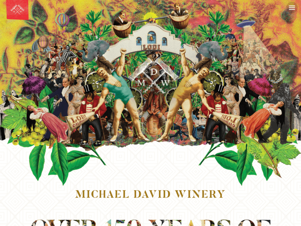
8. Michael David Winery
Now this is a unique winery website. Just look at that starting homepage image. Now, do yourself a favor and go to their website. That isn’t just an image, it’s an animated piece of art!
Michael David Winery has, without a doubt, the most impressionable website we’ve seen when looking for the top wine websites. Beautifully showcasing their most popular wines and directing their visitors to make choices – come visit, join the club, or join their newsletter.
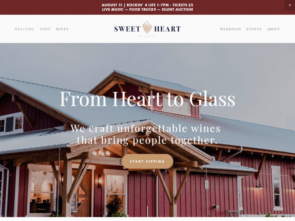
9. Sweet Heart Winery
Wine is better with company right? In the case of Sweet Heart Winery, regardless if it’s a get-together with friends or saying “I do” with your significant other, they make it obvious that their winery should be your first choice for sharing special memories.
Showcasing beautiful images of the grounds and happy couples alongside their wines makes this a hard-to-resist winery for groups or couples.
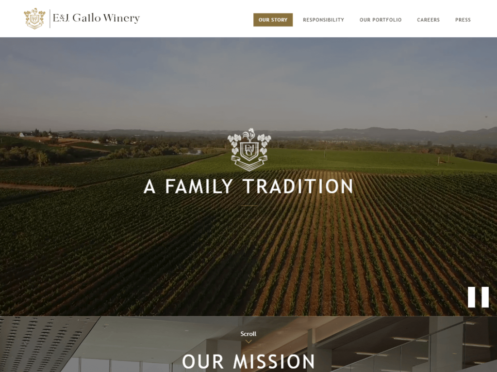
10. E & J Gallo Winery
With a design that opts out of the full screen layout that we’ve seen, E & J Gallo Winery make it obvious what’s most important to them, family heritage. They’ve designed their website to ensure visitors know who they are and what they are about.
What we really like about this website is their desire to share this information as their history section takes visitors decade by decade on how their company became one of the leading wine retailers in the world.
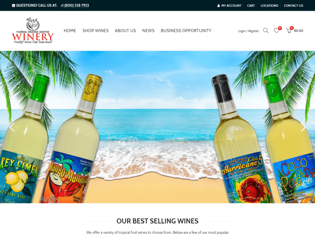
11. Florida Orange Groves
Despite having a design on the simpler side, this vineyard website makes full use of its tropical location and the variety of tropical wines they have to offer by including photos and backgrounds of sunny beaches and cool ocean waves.
A great example of how to keep a consistent theme through your product branding and web design.
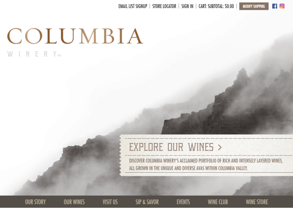
12. Columbia Winery
Another great example of “less is more” in web design. By utilizing a featured image that matches the color scheme of the website and limiting the number of navigation choices for visitors, the Columbia Winery makes good use of a rather small amount of design space.
When you want visitors to learn your story, view your wines, and visit your winery, it’s often better to design your website to push those options front and center – and this website does a great job of doing so.
How to NOT Design Your Winery Website
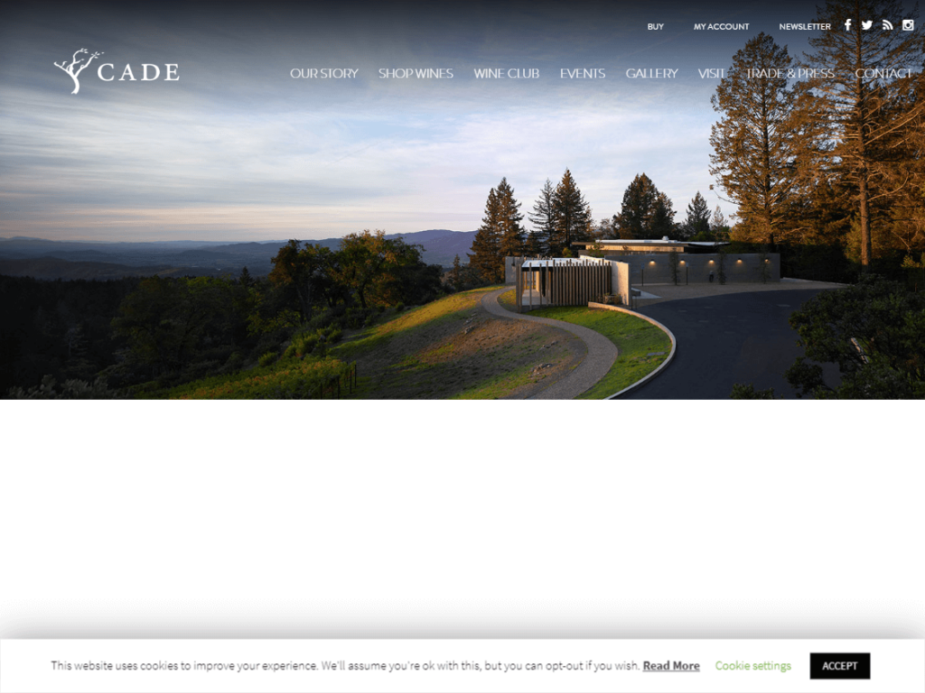
Unfortunately for CADE Winery, we decided to include their website in our list to showcase some design flaws we’d recommend avoiding.
In their case, the over-used and often mistakenly placed use of white space makes for an awkward design experience. We’re left wondering, did something not load right? Additionally, the font size used is a bit small, making it more difficult than it needs to be for visitors to read your content (most won’t bother reading it at all). Their wine shop showcases too much information and forces users to continuously scroll down to view the wine products.
Remember, the easier it is for users to navigate and view your wines, the better your odds will be of turning a visitor into a customer!

