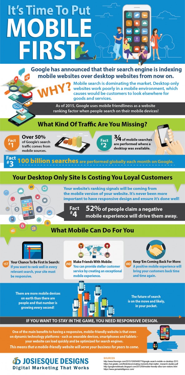
Mobile, mobile, mobile. Everyone is constantly talking about mobile. Google is currently testing out something they are calling Mobile First Indexing, which means they are indexing the mobile version of a website over the desktop version. It may not seem like a big deal, but it’s hugely important. Google is making it clear that it is cutting the cord, stepping away from the desk, and is focused on being on the move.
Don’t Let Desktop Only Hold You Back
It can feel easy to shrug off the importance of a mobile-friendly website. You’ve been running your successful business a long time and you are satisfied with the traffic that trickles in from the search engine giants. Most of your customers are people you’ve worked with for a long time. They know how to find you and they tell their friends about the great goods and services you offer. Your company is staffed by fantastic employees who treat your customers well. The company website- well, it might not the best looking thing on the Internet, but you feel that it gets the job done and it’s easy for people to contact your company directly. Who needs a responsive website? The truth is, EVERYONE does.
You Need Mobile To Be On Top
If you want your company to continue to be successful, you need to keep up with the times. As of 2015, Google has displayed mobile-friendly websites higher up in the search engine results pages (SERPs) when someone is searching from gadgets like smart phones and tablets. Searches on mobile devices occur much more than desktop searches these days. People in their own homes are using their mobile device over the computer sitting just feet away from them, because it’s just that convenient. That little bit of traffic trickling in from organic search for your desktop only website is awfully close to drying up.
Your Desktop Only Site is Costing You Business
What about your loyal customers, who go directly to your website when they need you? Even loyal customers are going to be affected by bad customer service- and having a mobile responsive website today is considered a great extension of customer service. The data doesn’t lie- according to a Sterling Research and SmithGeiger study, 52% of people have said that a poor mobile experience would make them less likely to work with a company. Why? It’s incredibly frustrating to navigate desktop websites from mobile devices. We’ve all been there- constantly resizing, hitting the wrong buttons, and struggling to read the content. Why continue to struggle when a competitor’s site is so much more easier to use?
No matter how much your customers like you as a person and a company, they are not going to keep coming back if every experience they have with your site leads to frustration. People enjoy the convenience of looking up information on their phones- your desktop site adds challenges that will cost you customers. Just like a nasty employee would drive your clientele away, non-responsive websites make people think you don’t care about their business.
 It’s Not Too Late To Go Mobile!
Responsive web design is an incredibly cost effective way to stay in the game. It shows your customers that you care about them- about getting the information they need from your site quickly and effortlessly. It helps them share information about your company with others. It demonstrates to the search engines that you are committed to quality- and they want to showcase high quality websites to make their search engine users happy. It’s time to extend your customer service to where your customers need you the most- at their fingertips, wherever they may be at any time.

