 There’s a new deadline in town, and it is April 21, 2015. Many of you have heard and read about Google’s Panda and Penguin algorithms. While these are significant updates, they still seem kind of ambiguous because Google has kept their ranking criteria vague on purpose.
The new Mobile-Friendly Ranking Algorithm is anything but ambiguous. On March 24, 2015, Google answered a series of questions on this new algorithm. Here is what is known so far:
1. The new algorithm will roll out on April 21st and will take anywhere from a few days to a week to reach globally.
2. Your website is either mobile-friendly or it is not. There are NO degrees of mobile-friendliness. This is, however, considered on a page-by-page basis. Mary, a Google representative says, “It is based on the criteria we mentioned earlier, which are small font sizes, your tap targets/links to your buttons are too close together, readable content and your viewpoint. So if you have all of those and your site is mobile friendly then you benefit from the ranking change.” Google also made a point to mention that even if you have all these mobile-friendly features on your site, they still take site content in mind. Relevant content is still key to search engine ranking!
3. There are many ways Google is currently warning you on whether or not they consider your site to be mobile-friendly. The easiest way is to search, while on your phone or tablet, for your website on Google and see if it has a mobile-friendly label. If you do not see one, then you need to visit the mobile-friendly testing tool Google provides to guide you on the roadblocks you face. Something else to take note of is that Google’s Webmaster Tools are on a delay whereas the mobile-friendly testing tool is not.
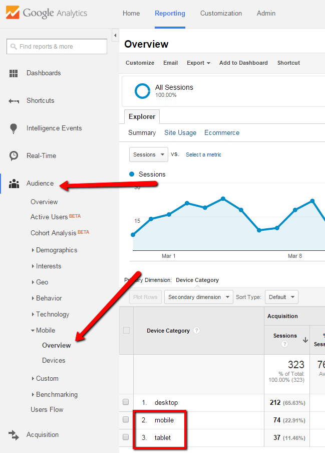
So if this algorithm only effects websites that receive traffic from people searching on Google through their phones/tablets, should it be of a concern to you? The answer is a resounding YES! If you have Google Analytics installed on your website (which most Josiesque Design clients do) there is an area that tells you specifically what percentage of visitors view your site on their mobile devices (see graphic on the right). And even if the majority of your visitors are using their desktop, you would be surprised at the statistics of those who are not.
But my website is already responsive so that means I’m just fine, right? Not nessacarily. This mobile-friendly ranking algorithm isn’t based on how responsive your website is. It’s based on the mobile-friendliness. The best way to tell which of these your site is considered is to utilize the mobile-friendly testing tool Google provides. Then contact Website Design Austin Texas now so we can get your site ready by the deadline.